How to Make a Basement Feel Taller Without Structural Changes
Low ceilings in basements are often treated as a fixed limitation, something to work around rather than something to reinterpret. I have seen this assumption shape entire renovation decisions, with homeowners focusing on what cannot be changed instead of questioning how the space is actually experienced. The idea that height is purely structural feels logical on paper, yet in practice, it rarely holds up.
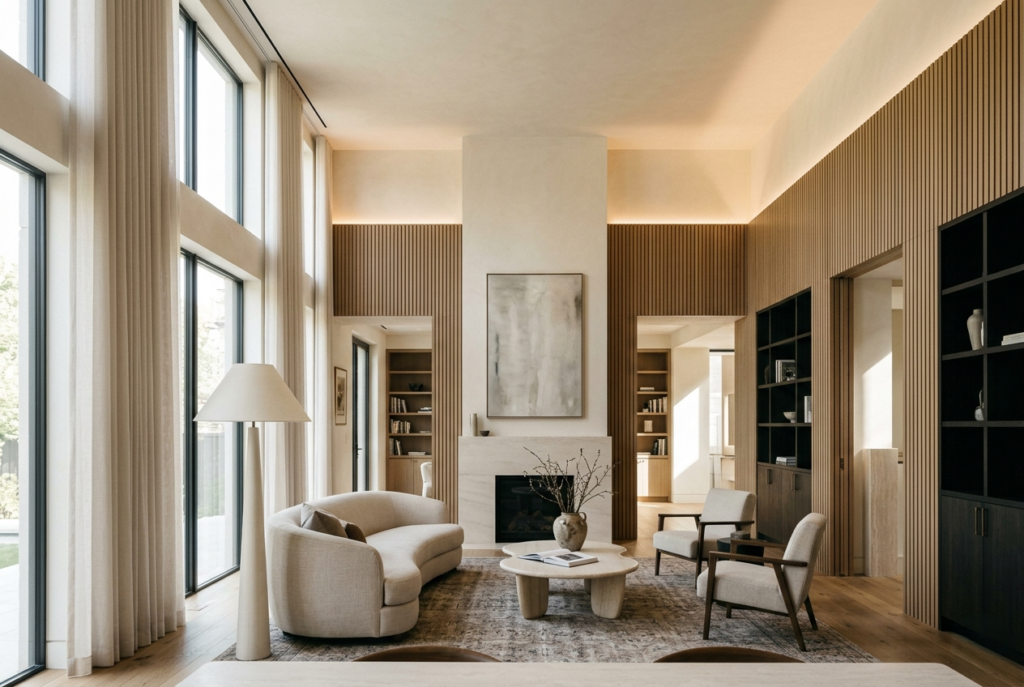
What we perceive as “height” is not just a measurement from floor to ceiling. It is a composition of light distribution, surface continuity, proportion, and where the eye is instinctively drawn. A ceiling at 2.2 metres, or roughly 7.2 feet, can feel either compressed or surprisingly open depending on how these elements are handled. The difference is not subtle either. It can shift the room from something that feels like an afterthought into a space that holds its own within the house.
I remember walking into a basement in a late Victorian terrace, a project that on paper should have felt restrictive. The ceiling height was modest, just over 2.1 metres, yet the room carried none of the heaviness you would expect. There was no dramatic intervention, no excavation, no structural alteration. Instead, the design had been handled with a kind of quiet precision. The ceiling and walls were treated as a continuous surface, light was allowed to travel rather than stop abruptly, and the furnishings sat low, almost deferential to the volume above. Nothing called attention to the limitation, and because of that, the limitation seemed to recede.
That experience stayed with me because it reinforced something I often return to in my own work. Spatial quality is rarely dictated by dimension alone. It is shaped by how boundaries are defined, softened, or, in some cases, visually dissolved. When a ceiling is emphasised as a hard line, it feels lower. When it becomes part of a larger, more fluid composition, it begins to lift, at least perceptually.
The core principle is straightforward, though the execution requires care. You do not need to raise the ceiling to change how tall a basement feels. You need to control how the eye moves through the space, how light interacts with surfaces, and how visual weight is distributed from floor to ceiling. When those elements are aligned, the room begins to stretch in ways that are not measurable, yet entirely convincing.
Understanding Perceived Height in Interior Design
Perceived height is less about the physical dimension between floor and ceiling and more about how the room is visually constructed. In basements especially, where structural limitations are often fixed, the sense of vertical space is shaped by alignment, contrast, and the way light moves across surfaces. I have found that when these elements are handled with intention, even a modest ceiling height can feel composed and open rather than constrained. The room begins to read as a continuous volume instead of a compressed box, which is where the real shift happens.
The Psychology of Vertical Space
The eye is naturally drawn along lines, and in interior spaces, those lines quietly dictate how we perceive proportion. Vertical lines encourage upward movement, creating a sense of lift, while horizontal lines anchor the gaze, often reinforcing the ceiling as a stopping point. This is why even subtle vertical cues, narrow wall panelling, full-height joinery, or uninterrupted curtain drops, can make a ceiling feel higher than it is. They guide the eye upward without announcing themselves, which is where their strength lies.
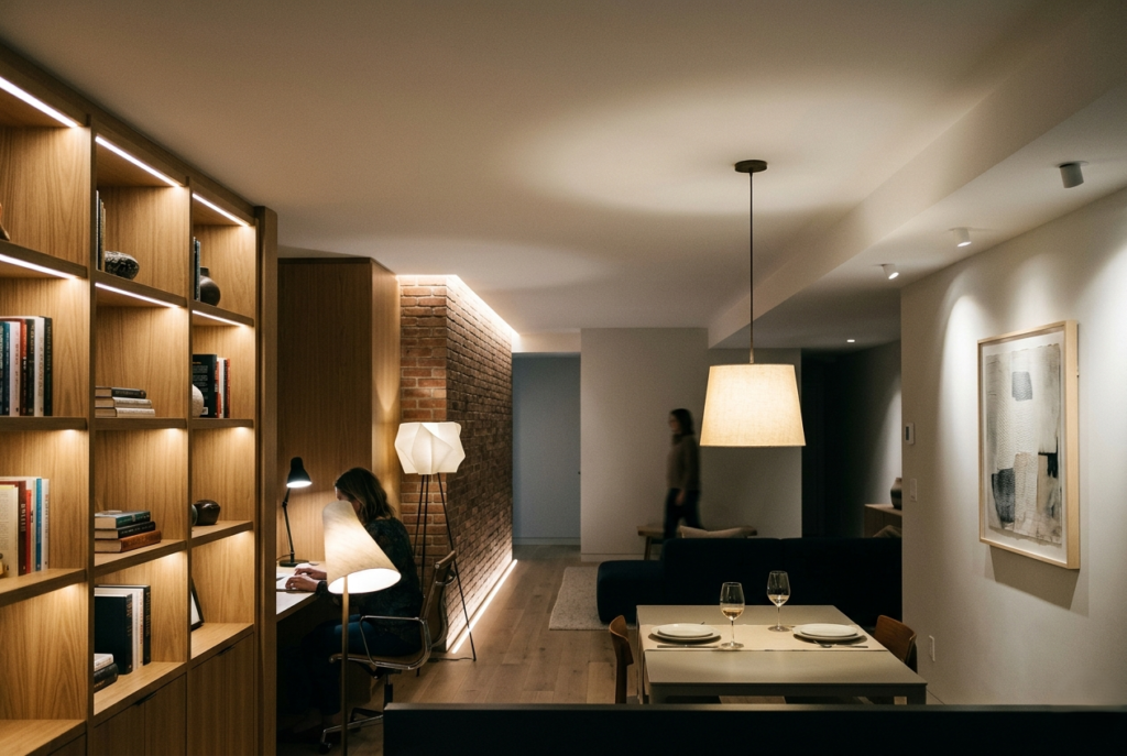
Light plays an equally critical role. When light travels vertically, washing up walls or diffusing gently across the ceiling plane, it softens the boundary between surfaces. The ceiling begins to feel less like a hard lid and more like a continuation of the room. In contrast, lighting that is concentrated at a single level, particularly at mid-height, tends to flatten the space, keeping the eye locked in one zone rather than allowing it to rise.
Contrast, when handled without restraint, can also work against perceived height. A strong shift between wall and ceiling colour creates a visual break that defines the ceiling edge too clearly. I have seen basements where a crisp white ceiling sits above darker walls, and instead of feeling fresh, it reads as a firm cap, almost pressing down into the room. When contrast is softened or extended across planes, the transition becomes less abrupt, and the ceiling appears to recede.
What becomes clear over time is that the eye is not measuring height in metres or feet. It is responding to continuity, rhythm, and the absence of interruption. When those qualities are present, the room feels taller almost instinctively.
Where Basements Typically Go Wrong
Most basements do not fail because of their dimensions. They fail because of a series of small, compounding decisions that unintentionally emphasise their limitations. The most common issue I encounter is the overuse of dark ceilings. While darker tones can work beautifully in certain contexts, in a low basement they tend to absorb light rather than reflect it. The result is a ceiling that feels heavier and closer, particularly in spaces with limited natural light.
Lighting distribution is another recurring problem. A reliance on evenly spaced downlights, often installed without considering how the light interacts with vertical surfaces, creates a flat and uniform illumination. Instead of adding depth, it spreads light thinly across the room, leaving walls underlit and the ceiling visually static. The space ends up feeling compressed, not because it lacks height, but because it lacks variation.
Furniture placement also plays a surprisingly significant role. I often see basements where bulky furniture is positioned at mid-height, sofas with high backs, storage units that sit awkwardly between low and full height, or layered shelving that cuts across the wall. This creates a visual band through the centre of the room, effectively dividing it horizontally. Once that line is established, the eye tends to settle there, reinforcing the perception of a lower ceiling.
When these elements combine, dark ceilings, flat lighting, and mid-level visual weight, the room begins to feel boxed in, even if the actual ceiling height is relatively standard for a basement. The issue is not the structure itself, but how consistently the design choices draw attention back to its limits.
Reworking Ceiling Presence Without Altering Structure
The ceiling is often treated as a fixed boundary, a surface that simply exists to finish the room. In basements, that assumption tends to work against the space. I approach the ceiling less as a plane to decorate and more as a surface to recalibrate. When handled with restraint and intent, it can visually recede, softening its own presence rather than asserting it. The goal is not to disguise the ceiling, but to reduce the clarity of where the wall ends and the ceiling begins. Once that line starts to blur, the room gains a quiet sense of vertical release.
Paint as a Spatial Tool, Not Decoration
Paint, when used with precision, becomes one of the most effective tools for altering spatial perception. In low-ceiling basements, I tend to favour soft, light-reflective finishes that carry light rather than interrupt it. This is not about choosing a generic white, but about selecting a tone with enough warmth to avoid starkness while still maintaining a high light reflectance value. Surfaces should feel luminous rather than bright, absorbing and releasing light in a controlled way.
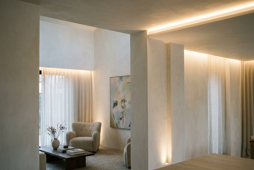
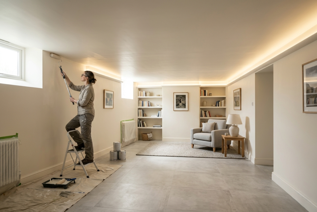
The key move, often overlooked, is extending the wall colour onto the ceiling. By removing the tonal break between vertical and horizontal planes, the eye is no longer given a clear stopping point. The ceiling stops reading as a separate element and instead becomes part of a continuous envelope. It is a subtle shift, but one that changes the entire perception of height. In spaces where the ceiling is already low, this continuity allows the room to feel composed rather than capped.
This approach works particularly well in basements where natural light is limited. A continuous palette allows artificial light to travel more evenly, avoiding harsh contrasts that can emphasise the ceiling line. I have also found that matte or soft eggshell finishes tend to perform better than high-gloss options in these conditions. They diffuse light gently, avoiding reflections that can draw attention to surface imperfections or unevenness.
Real-Life Insight:
In one project, I used a continuous warm off-white (approximately LRV 75+) across both walls and ceiling in a 2.2 m / 7.2 ft basement. The visual seam disappeared almost entirely, making the ceiling feel less like a lid and more like an extension. The room did not feel taller in a measurable sense, yet it carried a lightness that had not been there before. It was a reminder that perception often hinges on what is not emphasised.
Pros:
- Immediate visual impact without structural intervention
- Cost-effective compared to material changes
- Adaptable across most basement layouts and lighting conditions
Cons:
- Requires carefully planned lighting to prevent the space from feeling flat or washed out
- Lower-quality paint or poor surface preparation can expose imperfections, particularly on ceilings where flaws catch light differently
2. Vertical Emphasis Through Wall Treatment
When ceiling height cannot change, the next most effective move is to influence how the eye travels through the room. Wall treatments, when handled with restraint, can introduce a vertical rhythm that gently pulls the gaze upward. The intention is not to decorate the wall, but to choreograph movement across it. Done well, the effect is almost subconscious. The room begins to feel taller not because anything has physically shifted, but because the eye is no longer settling at mid-height.
Subtle Vertical Lines That Guide the Eye Upwards
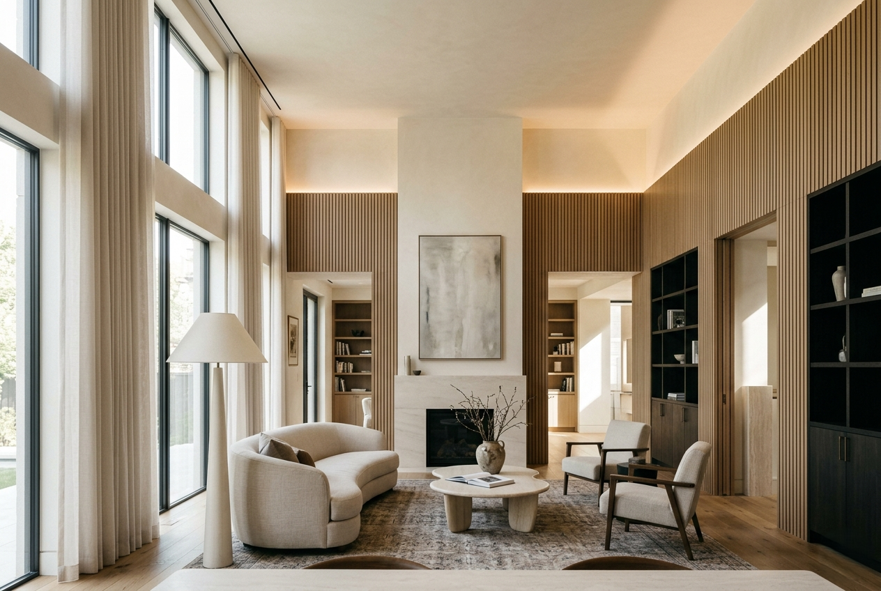
Vertical articulation works best when it is quiet and consistent. I tend to avoid anything overly pronounced or decorative, favouring instead fluted panels, narrow timber battens, or even simple shadow gaps that run uninterrupted from floor to ceiling. These elements introduce a cadence, a repeated upward motion that encourages the eye to rise without interruption.
The key is subtlety. If the lines become too bold or too closely spaced, they start to compete for attention, and the wall can feel visually compressed rather than elongated. I have found that a restrained approach, where the detailing sits just beneath immediate perception, tends to deliver the most convincing results. It is the difference between guiding the eye and forcing it.
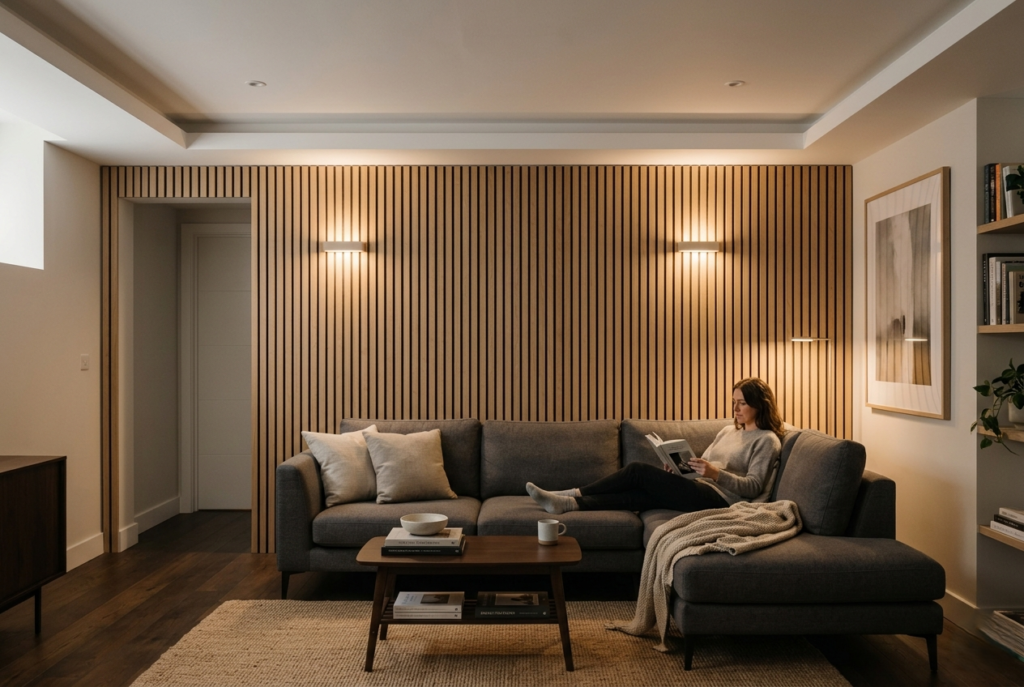
In one basement media room I worked on, we introduced slim vertical battens along a single feature wall behind the seating area. The ceiling height was just under 2.2 m (7.2 ft), yet the vertical rhythm created a sense of lift that the room had previously lacked. Nothing about the intervention felt overt, but the spatial reading shifted almost instantly.
Controlled Contrast Placement
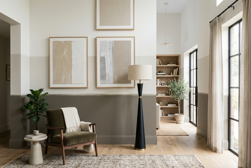
Contrast, when used strategically, can reinforce this vertical movement. Rather than applying a uniform colour across the entire wall, I often introduce a slightly deeper tone along the lower portion, typically up to 900–1100 mm (35–43 inches). This anchors the room visually, allowing the upper wall and ceiling to feel lighter and more expansive by comparison.
The transition needs to be handled with care. A hard horizontal break can undo the effect by reintroducing a strong dividing line. Instead, I prefer either a very subtle tonal shift or a material change that feels integrated rather than applied. The aim is to ground the space without creating a visual ceiling at eye level.
Measurements & Application
- Battens spaced at 30–50 mm (1.2–2 inches) establish a consistent rhythm without overcrowding the surface
- Panel or batten height should run full floor-to-ceiling wherever possible, avoiding breaks that interrupt vertical flow
- If introducing tonal variation, keep the lower section proportionally balanced, typically no more than one-third of the wall height
Pros
- Creates a strong architectural language without adding physical bulk
- Enhances depth and perceived height simultaneously
- Works across both contemporary and more traditional basement settings
Cons
- Overuse or excessive density can feel visually busy, reducing the intended effect
- Requires careful coordination with lighting, as poorly placed fixtures can disrupt the vertical rhythm
3. Lighting Strategy That Lifts the Ceiling
Lighting is where many basements either recover their spatial quality or quietly lose it. I have seen well-proportioned rooms feel compressed simply because the light was handled without intent. In low ceilings, illumination should not sit passively within the space. It needs to shape it. The aim is to draw light upward, soften boundaries, and allow the ceiling to recede rather than assert itself. When that balance is right, the room gains a sense of vertical ease that no structural change could replicate.
Layering Light Vertically Instead of Horizontally
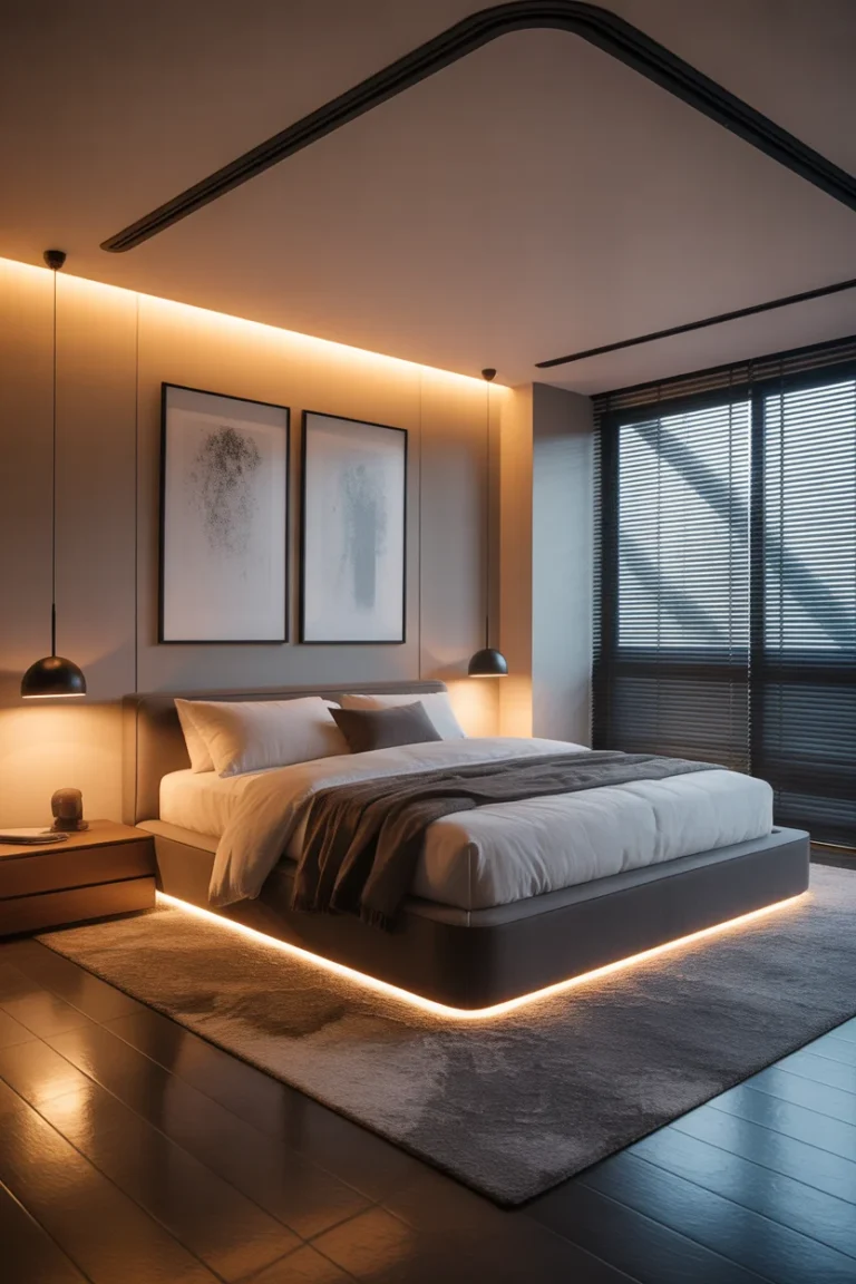
A common mistake is concentrating light at a single level, typically through ceiling fixtures that distribute illumination evenly but without direction. In contrast, vertical layering introduces movement. Wall washers, discreet uplighting, and concealed LED strips positioned close to the ceiling line allow light to travel upwards, gently illuminating vertical planes before diffusing across the ceiling surface.
This upward wash does two things simultaneously. It reduces shadow density along the walls, making them feel taller, and it softens the ceiling edge so it no longer reads as a hard boundary. The effect is subtle but cumulative. The room begins to feel less enclosed, almost as if the ceiling has lifted slightly away from the walls.
In practice, I tend to integrate lighting into architectural details wherever possible. A shallow recess, a pelmet, or even a slim shadow gap can house LED strips without exposing the source. The light should feel ambient and indirect, never harsh or overly defined. When the source disappears, the effect becomes more convincing.
Avoiding the “Grid of Downlights” Trap
Evenly spaced downlights are often treated as a default solution, particularly in basements where ceiling heights are already tight. While they provide functional illumination, they tend to flatten the space. The light falls directly downward, creating uniform brightness but very little variation. Walls remain underlit, and the ceiling is punctuated by a series of visible fixtures that reinforce its presence rather than diminish it.
This grid effect can unintentionally emphasise the ceiling as a plane. Each fitting acts as a marker, drawing attention to the exact height of the surface. Instead of receding, the ceiling becomes more defined, almost mapped out overhead.
That is not to say downlights have no place. I still use them, but selectively and often in combination with other light sources. The key is to avoid relying on them as the primary layer. When balanced with vertical lighting, they can provide task illumination without compromising the overall spatial reading.
Real-Life Insight:
I once replaced a dense downlight grid with perimeter LED uplighting in a 2.1 m / 6.9 ft basement. The ceiling visually receded, almost as if it had been raised by several inches. Nothing about the structure had changed, yet the atmosphere shifted entirely. The space felt calmer, more open, and far less constrained.
Specifications
- LED strip placement: 50–75 mm (2–3 inches) below the ceiling line to create a soft upward wash
- Colour temperature: 2700K–3000K to maintain warmth while preserving clarity
- Diffusers: essential to ensure an even spread of light and avoid visible hotspots
Pros
- Creates a noticeable shift in perceived height without altering structure
- Enhances overall atmosphere, making the space feel more considered and layered
- Allows for greater flexibility in mood and lighting control
Cons
- Requires precise installation and coordination with ceiling and wall details
- Poor diffusion or incorrect placement can result in glare or uneven lighting, which undermines the effect
4. Furniture Scaling That Respects Ceiling Limits

Furniture is often where good spatial intentions quietly unravel. In basements, especially, the wrong proportions can reinforce the very constraint you are trying to soften. I tend to think of furniture not as individual objects, but as part of the room’s vertical composition. Where pieces sit in relation to the floor and ceiling determines how the eye reads the available height. Get that balance right, and the room begins to breathe. Get it wrong, and the ceiling feels as though it has dropped a few inches overnight.
Low-Profile Pieces That Expand Vertical Breathing Room
Low-slung furniture creates what I often describe as vertical breathing room. By keeping the bulk of the furnishings closer to the floor, you allow a larger uninterrupted volume of space above, which the eye instinctively reads as height. Sofas with lower backs, streamlined coffee tables, and minimal storage pieces all contribute to this effect.
The shift is subtle but powerful. When the furniture line drops, the perceived ceiling line rises. I have applied this repeatedly in basement lounges where the ceiling height sits around 2.1 to 2.3 metres (6.9 to 7.5 feet). By selecting seating with a reduced back height and keeping visual weight grounded, the upper portion of the room begins to feel lighter, almost released from pressure.
There is also a compositional benefit. Low-profile furniture tends to create longer sightlines across the room, which enhances the sense of openness. The space feels less interrupted, more continuous, as though it has room to extend rather than close in.
Avoiding Mid-Height Bulk
If low furniture lifts a room, mid-height bulk does the opposite. Pieces that sit awkwardly between low and full height, such as tall sideboards, stacked shelving, or bulky cabinets, often create a horizontal band across the space. This is where the eye settles, and once it does, the ceiling above begins to feel closer.
Tall cabinetry can be equally problematic when not handled carefully. When it stops short of the ceiling, it creates a visual break that emphasises the remaining gap. That gap, rather than feeling like space, reads as a leftover proportion, drawing attention to the ceiling height in an unhelpful way.
When storage is necessary, and it usually is, I tend to take one of two approaches. Either keep it deliberately low, allowing the wall above to remain open, or extend it fully to the ceiling so it reads as part of the architecture rather than an inserted element. The in-between zone is where most basements lose their sense of vertical clarity.
Measurements & Application
- Sofa height: ideally under 850 mm / 33 inches to maintain a lower visual horizon
- Coffee tables: typically between 300–400 mm / 12–16 inches to keep sightlines open
- Storage units: either below 900 mm / 35 inches or fully integrated to ceiling height for a cleaner vertical read
Pros
- Creates immediate spatial relief without any structural or material intervention
- Improves visual flow and continuity across the room
- Reinforces other vertical strategies, such as lighting and wall treatments
Cons
- Limited off-the-shelf options in some markets, often requiring custom or carefully sourced pieces
- Needs considered styling to avoid the space feeling under-furnished or lacking presence
5. Flooring Continuity That Expands Perception
Flooring rarely gets discussed in conversations about ceiling height, yet it plays a quiet but decisive role in how a basement is experienced. The floor is the largest uninterrupted surface in the room, and when it is handled with clarity, it sets the tone for everything above it. I tend to think of it as the foundation of visual flow. If the floor feels fragmented or overly busy, the eye has nowhere to travel, and the room begins to feel compressed. When it is continuous and calm, the space opens up almost instinctively.
Seamless Surfaces That Reduce Visual Breaks
Continuity is the guiding principle here. Wide planks, large-format tiles, or polished concrete finishes work particularly well because they minimise visual joints and interruptions. Each break in the surface, whether it is a grout line, a threshold strip, or a material change, acts as a subtle stop for the eye. Enough of these interruptions, and the room starts to feel shorter, tighter, and more contained.
In basements, where ceiling height is already limited, reducing these breaks becomes even more important. A continuous flooring finish that runs from one end of the room to the other allows the eye to move freely, which in turn supports the perception of both length and height. It is not an obvious effect, but it is a cumulative one. The fewer visual obstacles the eye encounters, the more expansive the space begins to feel.
Material choice also matters. Finishes with a soft, low-sheen surface tend to perform better than highly reflective ones, particularly in artificial lighting conditions. They provide enough texture to feel grounded without introducing unnecessary visual noise.
Directional Laying Patterns
Beyond continuity, direction plays a subtle but important role. The way flooring is laid can influence how the proportions of a room are read. In narrower basements, running planks lengthwise helps elongate the space, encouraging the eye to travel further before it meets a boundary. This extended horizontal movement has an indirect effect on perceived height. When a room feels longer, it often feels less compressed vertically.
The key is alignment. Flooring direction should work with the natural flow of the room, typically following the longest dimension or the primary line of sight. When laid inconsistently or against the room’s geometry, the effect can feel disjointed, undermining the sense of cohesion.
Real-Life Insight:
In a narrow basement lounge, extending engineered wood planks at 180 mm (7 inches) wide across the full length created a subtle sense of expansion. The room did not physically change, yet it felt less confined, and interestingly, the ceiling seemed to carry less weight. It was a reminder that proportion is often perceived holistically. When one dimension improves, the others tend to follow.
Pros
- Enhances overall flow, allowing the eye to move uninterrupted
- Supports other spatial strategies by creating a calm visual base
- Works subtly, improving perception without drawing attention to itself
Cons
- Requires precise installation, particularly with wider planks or large-format materials
- Poor joins, uneven transitions, or inconsistent alignment can disrupt the intended effect and make the space feel more fragmented
6. Strategic Use of Mirrors and Reflective Surfaces
Mirrors in basement design are often misunderstood as decorative amplifiers of light alone. In reality, their more powerful role lies in how they distort and extend perceived boundaries. When used with intention, they can quietly challenge the sense of enclosure that low ceilings naturally create. I tend to approach reflective surfaces not as ornamentation, but as spatial instruments that can either elevate a room or expose its limitations, depending on placement and restraint.
Reflecting Vertical Planes Instead of Just Light
The most effective use of mirrors in low-ceiling basements is not simply about bouncing light around the room, but about extending vertical perception. When a mirror reflects a full-height wall or a continuous vertical element, it effectively doubles the reading of height. The eye is no longer anchored to a single boundary; instead, it begins to register a layered depth that feels taller than the actual structure.
Placement is everything here. A mirror positioned opposite a strong vertical feature, such as a fluted wall, tall curtain drop, or uninterrupted shelving line, reinforces upward movement. It is less about the mirror itself and more about what it is reflecting. I often avoid placing mirrors low or fragmented, as this tends to compress the visual field rather than expand it. Full-height or vertically oriented placements tend to deliver a far more convincing spatial lift.
In one basement hallway project, a tall, narrow mirror was positioned at the end of the corridor to reflect a softly lit vertical wall wash. The effect was subtle but powerful. The corridor felt longer, and more importantly, it felt taller, almost as if the ceiling had been gently pulled upward through repetition rather than force.
Controlled Reflection, Not Excess
Reflective surfaces require discipline. While they can enhance light and expand perception, overuse quickly shifts the space into something that feels artificial or visually unstable. Highly glossy finishes, when applied across large areas, can create an environment that feels over-processed, where reflections compete rather than support spatial clarity.
I tend to favour controlled reflection instead. This might be a single large mirror integrated into joinery, or selectively polished materials used in moderation, rather than a proliferation of mirrored surfaces. The aim is to introduce depth without visual confusion. In basements, where natural light is already limited, too many reflections can begin to feel disorienting rather than expansive.
Matte and semi-reflective finishes often provide a better balance. They catch light softly without creating harsh duplication of the room, allowing the space to remain grounded while still benefiting from increased brightness and perceived openness.
Pros
- Amplifies both light distribution and perceived vertical height
- Particularly effective in basements with limited natural daylight
- Can subtly extend architectural features without physical alteration
Cons
- Overuse can feel staged or visually disjointed if not carefully controlled
- Requires thoughtful placement aligned with vertical architectural elements to avoid flattening or fragmenting the space
7. Curtain and Window Treatments That Stretch the Wall
Window treatments in basements are often treated as an afterthought, yet they carry disproportionate influence over how tall a space feels. I have consistently found that curtains, when handled with architectural intent rather than purely decorative logic, can redraw the proportions of a room. They become vertical framing devices, guiding the eye upward and softening the structural limits that define a basement. In many cases, they do more to elevate perceived height than the windows themselves ever could.
Full-Height Drapery Even for Small Windows
One of the most effective strategies is to treat every window as if it were full height, regardless of its actual size. By mounting curtains close to the ceiling line, the wall is visually extended upward, and the window becomes secondary to the vertical rhythm of the fabric. This is a subtle but powerful shift. The wall stops being read as a segmented surface and starts to feel continuous, as though it stretches further than it physically does.
Even in basements with small or horizontally proportioned windows, this approach creates a sense of vertical exaggeration. The fabric draws the eye from floor to ceiling in a single uninterrupted movement. I often extend curtain tracks wall-to-wall in tighter spaces, which further reinforces this effect by eliminating visual breaks at the edges.
The key is discipline in placement. Curtains hung at standard window height tend to compress the room visually, reinforcing the exact proportion you are trying to avoid. Raising the mounting point, even by a modest margin, can completely change how the room is read.
Light, Fluid Fabrics That Don’t Interrupt Flow
Material choice is equally important. Heavy, dense fabrics tend to anchor the eye too firmly, especially in low-ceiling environments where visual weight already accumulates quickly. Instead, I lean towards light, fluid textiles that fall cleanly and move slightly with air circulation. Linen blends, soft cottons, or sheer layered systems work particularly well because they allow light to filter through while still maintaining vertical presence.
The objective is continuity, not opacity. The fabric should behave like a soft vertical plane rather than a solid wall. When curtains are too heavy or overly textured, they introduce visual interruptions that can shorten the perceived height of the room.
In one basement conversion, I used a full-height sheer curtain system in a narrow living space with limited natural light. The fabric was mounted just below the ceiling line and allowed to fall to the floor with a slight break. The result was not dramatic in a theatrical sense, but it subtly shifted the room’s proportions. The walls felt taller, and the space carried a quiet softness that made the ceiling feel less imposing.
Measurements
- Curtain rod placement: 100–150 mm (4–6 inches) below ceiling to maximise vertical extension
- Drop length: full floor contact or slight pooling to reinforce uninterrupted vertical flow
Pros
- Creates a strong vertical reading that enhances perceived ceiling height
- Softens hard architectural edges, making basements feel more habitable and balanced
- Works well in both narrow and wider basement layouts
Cons
- Can overwhelm very small rooms if fabric is too heavy or overly textured
- Requires careful coordination with flooring and furniture to avoid visual congestion at floor level
8. Ceiling Details That Disappear Rather Than Dominate
Ceilings in basements often carry more visual responsibility than they should. Every exposed service, bulky fixture, or abrupt transition competes for attention in a space that is already dealing with limited height. In my experience, the most successful basement ceilings are not the ones that try to be expressive, but the ones that quietly step back. The objective is simple: reduce visual noise overhead so the eye can move without interruption, allowing the room to feel taller by default rather than by design emphasis.
Minimising Visual Interruptions
The first principle is concealment through integration. Recessed lighting, flush-mounted vents, and carefully coordinated service runs all help to flatten the ceiling’s visual profile. When these elements sit level with the ceiling plane rather than projecting from it, the surface reads as continuous. That continuity is what allows the ceiling to recede perceptually.
I tend to avoid anything that creates unnecessary depth or shadow at ceiling level. Even small protrusions can cast visual fragments that break the sense of uniformity. In low-ceiling basements, those fragments accumulate quickly, and the ceiling begins to feel busier and lower than it actually is.
Ventilation grilles, access panels, and electrical fittings should be treated as part of a single composition rather than isolated components. When aligned and finished in the same tone as the ceiling, they almost disappear into the background. The result is not minimalism for its own sake, but a controlled visual field where nothing draws the eye upward unless it is intentionally designed to do so.
I have seen this approach transform rooms that initially felt cramped and utilitarian. Once the overhead clutter was removed or visually absorbed, the ceiling stopped asserting itself and instead became part of a broader atmospheric envelope. The change is subtle, but the psychological effect is significant.
When to Embrace Beams (and When Not To)
Exposed beams can either enhance or undermine a basement, depending entirely on how they are handled. In some spaces, especially those with inherent structural character, beams can add rhythm and direction. However, in low-ceiling environments, they can just as easily reinforce compression if left visually heavy or overly contrasted.
When beams are unavoidable, I prefer to integrate them rather than highlight them. This might mean painting them in the same tone as the ceiling to reduce contrast, or refining their profile so they feel lighter and less obstructive. The goal is not to erase them entirely, but to prevent them from visually segmenting the ceiling plane.
Where possible, I avoid introducing decorative beam systems purely for aesthetic effect in basements with restricted height. They often introduce horizontal breaks that counteract every other strategy aimed at increasing perceived vertical space. If they are present structurally, the design response should be one of quiet acceptance rather than emphasis.
In one project, we inherited a basement with multiple service beams running across the ceiling. Instead of trying to disguise them completely, we softened their presence through a unified matte finish and aligned lighting that washed across rather than undercut them. The result was a ceiling that felt continuous in mood, even if not entirely uninterrupted in form.
Pros
- Creates a calm, uninterrupted visual field overhead
- Reduces perceived clutter, allowing the room to feel more open and taller
- Enhances the effectiveness of lighting and wall-based vertical strategies
Cons
- Often requires early coordination with contractors and services planning
- Limited flexibility in existing structures where services are already exposed or fixed in position
Common Mistakes That Make Basements Feel Lower
In most basement projects I have worked on, the issue is rarely the ceiling height itself. It is the accumulation of small design decisions that quietly compress the space. These mistakes often feel harmless in isolation, yet together they create a strong horizontal bias that pulls the room downward. Once you recognise these patterns, it becomes easier to understand why some basements feel boxed in, while others feel unexpectedly generous despite sharing similar dimensions.
Dark Ceilings Paired With Light Walls
This is one of the most common missteps. On paper, the contrast seems logical, a lighter wall to open the room, a darker ceiling to add mood or conceal imperfections. In reality, it often produces the opposite effect. A dark ceiling acts as a visual lid, sharply defining the upper boundary of the space. When paired with lighter walls, the contrast becomes even more pronounced, drawing a clear horizontal line that the eye cannot ignore.
Instead of dissolving the ceiling, this approach anchors it firmly in place. The room feels capped, almost as if the weight of the darker surface is pressing down on the space below. I have found that reducing this contrast or extending tones across surfaces creates a far more fluid reading of height.
Over-Layered Lighting at One Level
Lighting errors in basements tend to follow a predictable pattern. Rather than layering light vertically, many spaces rely heavily on a single plane of illumination, typically ceiling-mounted downlights. When too many fixtures are concentrated at this level, the effect becomes flat and repetitive. The ceiling is not softened or lifted; it is simply lit more evenly, which paradoxically makes its presence more obvious.
The problem is not brightness, but distribution. When light does not travel down walls or interact with vertical surfaces, the room loses depth. Everything feels locked into a single horizontal band, and the ceiling becomes part of that static composition. It is a subtle flattening effect, but it has a strong impact on perceived height.
Heavy, Bulky Furniture Clustered Centrally
Furniture placement can either open a basement or quietly compress it. One of the most common issues is clustering heavy pieces in the central field of the room. Large sofas, tall storage units, or dense seating arrangements positioned mid-space create a visual blockage that interrupts flow and traps the eye at mid-height.
When this happens, the room loses vertical clarity. The eye has nowhere to travel upward, so it settles into the densest part of the composition. I often describe this as a “mid-height weight zone,” where everything feels compressed between floor and ceiling.
Relocating or re-scaling furniture so that it either sits low or integrates fully into the architecture helps restore balance. The centre of the room should feel open, not occupied by visual bulk.
Excessive Contrast Cutting the Room Horizontally
Strong horizontal contrast is another subtle but powerful issue. This can appear through paint divisions, material changes, shelving lines, or even lighting transitions. When these elements align at similar heights, they create a visual break that slices the room into distinct layers.
Once that horizontal line is established, the eye tends to anchor to it. Instead of reading the room as a continuous volume, it becomes segmented. This segmentation reduces perceived height because the vertical journey is interrupted repeatedly.
In well-resolved basement interiors, contrast is either softened or carefully staggered so that no single horizontal line dominates. The goal is continuity, not fragmentation. When the eye can move freely upward without hitting visual stops, the ceiling naturally feels further away than it actually is.
Final Thoughts: Height Is Felt Before It Is Measured
Across every basement project I have worked on, one idea keeps returning with quiet consistency. Height is rarely a matter of dimensions alone. It is something the body reads before the mind calculates. The moment you step into a space, your perception begins forming through light, rhythm, contrast, and proportion. By the time you have noticed the ceiling height in numbers, your experience of the room has already been decided.
This is why design carries such weight in low-ceiling environments. It does not change the structure, but it completely alters how the structure is understood. A basement can remain exactly as it is, yet feel entirely different depending on how its surfaces are treated, how light is layered, and how visual interruptions are managed. The most successful spaces are not those that attempt to disguise their constraints, but those that refine them until they no longer dominate the experience.
I have often found that the best basements do not fight their proportions. They work with them, quietly shaping perception through restraint rather than intervention. There is a certain confidence in that approach. It avoids unnecessary noise, avoids overstatement, and instead focuses on coherence. When every decision supports the next, the space begins to feel intentional, almost inevitable in its composition.
Quick fixes rarely achieve this effect. They tend to address one surface or one problem in isolation, without considering how the entire room is read as a whole. In contrast, layered decision-making, where lighting, materials, furniture, and proportion are considered together, creates a far more convincing result. It is less about dramatic transformation and more about cumulative refinement.
In the end, a basement that feels taller is not the result of a single idea. It is the outcome of many small, disciplined choices working in the same direction. When those choices align, the ceiling stops feeling like a limitation and starts behaving like part of a larger spatial narrative.
FAQs: How to Make a Basement Feel Taller Without Structural Changes
What is the most effective way to make a basement feel taller without renovation?
From experience, the strongest impact comes from combining three layers: ceiling colour continuity, vertical lighting, and low-profile furniture. No single intervention carries the space alone. When these work together, the ceiling visually recedes and the room begins to feel more open almost immediately.
Does painting the ceiling the same colour as the walls really make a difference?
Yes, and quite a significant one. Extending the same tone across walls and ceiling removes the hard visual break that usually defines ceiling height. I have seen even small basements around 2.1–2.3 m (6.9–7.5 ft) feel noticeably less compressed simply through this adjustment.
Are mirrors a good solution for low basement ceilings?
They are effective when used with restraint. The key is not just reflection, but what is being reflected. Mirrors that capture vertical lines, full-height walls, or continuous lighting elements can extend perceived height. Overuse, however, can create visual noise and reduce spatial clarity.
What type of lighting works best for low-ceiling basements?
Indirect and layered lighting works best. Uplighting, wall washers, and concealed LED strips near the ceiling line help lift the room visually. I typically avoid relying on dense downlight grids, as they tend to flatten the ceiling and reinforce its presence rather than reduce it.
Can furniture really affect how tall a basement feels?
Absolutely. Furniture establishes the mid-point of the room visually. Low-profile pieces keep the upper volume open, while bulky or mid-height furniture can compress the space. In practice, keeping sofas under 850 mm (33 inches) in height makes a noticeable difference in perceived openness.
Do vertical wall panels or fluted designs help with height perception?
Yes. Vertical detailing encourages the eye to move upward, which subtly enhances perceived height. When used with restraint, such as evenly spaced battens or full-height panels, it creates rhythm without visual clutter. Overuse, however, can make the space feel busy.
What is the biggest mistake people make in basement design?
The most common issue is treating elements in isolation. A dark ceiling, flat lighting, and bulky furniture might seem acceptable individually, but together they compress the space significantly. The real challenge is ensuring all design decisions support vertical continuity.
Can a basement really feel taller without changing the structure?
Yes, and quite convincingly. While the physical height remains the same, perception can be reshaped through light, colour, proportion, and material continuity. In many projects I have worked on, the psychological shift has been strong enough that clients forget the original constraint entirely.